Product Design SF Fire Credit Union

About the Project
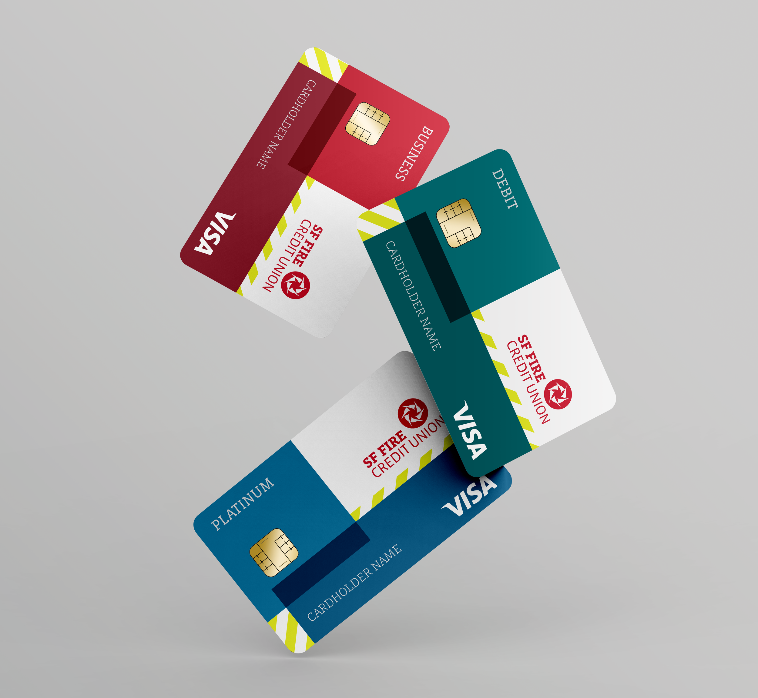
Financial institutes primarily offer intangible services, so it was an amazing experience to work on something physical that members would use daily.
In late 2019, SF Fire CU rolled out a brand redesign. Everything from envelopes to emails needed an overhaul.
The new SF Fire CU cards made use of the popular color-blocking in the new brand identity. Not only did this create a fun and modern look, but the bold colors made it easy to find the right card in one’s wallet.