Label Design Gold Country Canning

As an up-and-coming pickled goods company, Gold Country Canning wanted a bold and unique look for their brand.
Based in Sacramento with ties to the Bay Area, Gold Country Canning wanted to create a brand based on the rich history of California’s heartland and coast.
California Gold
In the highly competitive industry of small batch food production, bold, memorable branding is key. Since early business growth starts at farmers markets and small business deals, we needed something that would be memorable from a single glance.

Logo Design
To incorporate classical Gold Rush imagery, I referenced 1800s typography ads and the styling of liquor labels. We chose black and gold to fit the theme. The black is a wonderful stark contrast to competing picklers.
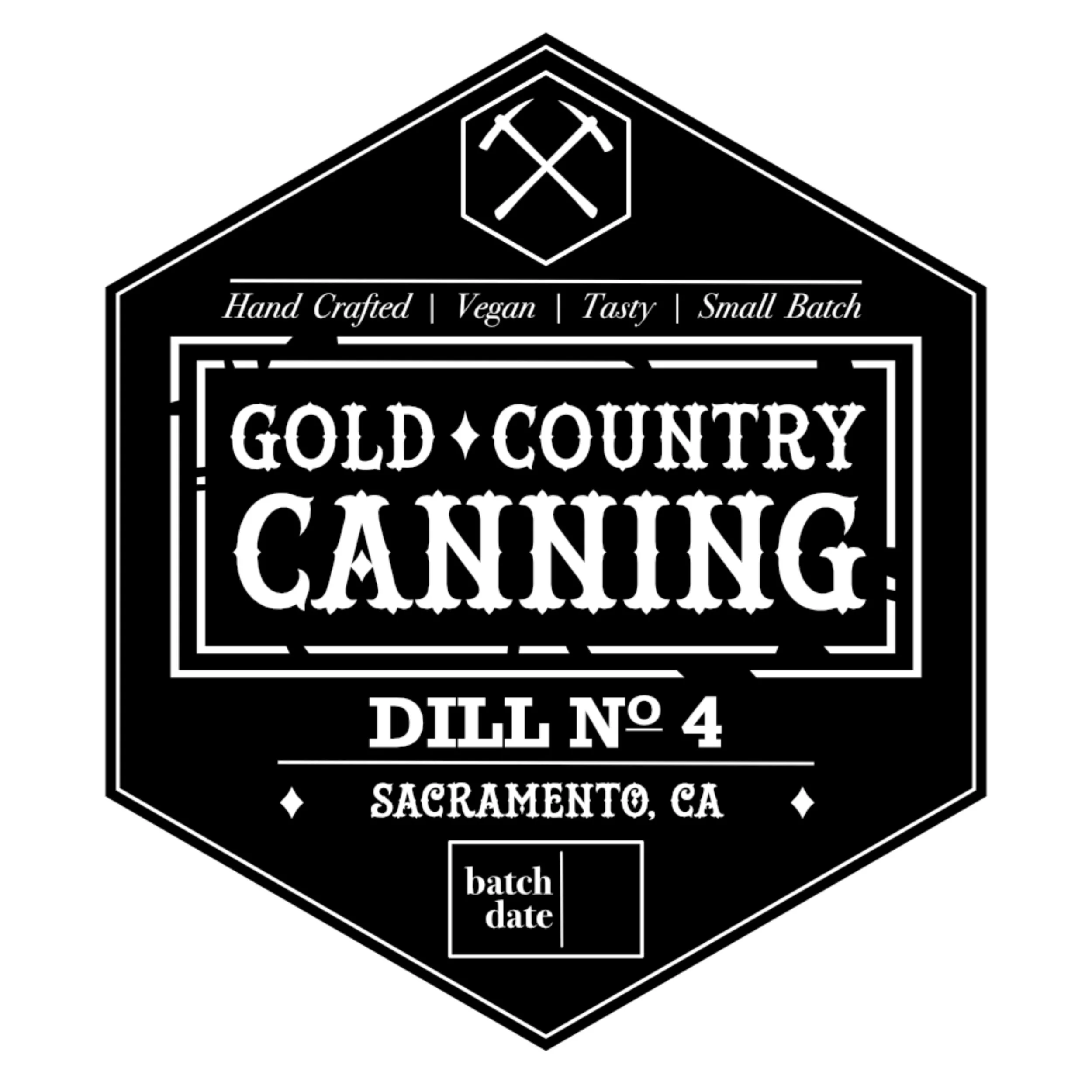
Label Design
The best thing about black is that it matches everything. I really leaned into the 1800s typography style for the labels, aiming for something you’d see at an old general store.
Pickle Labels
A hexagonal shape allowed me to play with a more dynamic design, creating a strong geometric frame while also staying unique among competing brands.